import seaborn as sns # 导入 Seaborn 库数量与分布可视化
1. Seaborn 与 Matplotlib
注意: 本地 VS Code 环境需先安装 Seaborn;Google Colab 已预装,无需安装。
pip install seabornimport matplotlib.pyplot as plt # 导入 Matplotlib 库matplotlib.pyplot 通常缩写为 plt,以便快速调用绘图接口。不推荐使用完整路径:
    import matplotlib.pyplot     # 从 matplotlib.pyplot 接口导入 Matplotlib 库
    matplotlib.pyplot.plot(略)  # 用 .plot() 函数画图
    matplotlib.pyplot.show()     # 用 .show() 函数展示画好的图表
推荐写法:
    import matplotlib.pyplot as plt # 从 matplotlib.pyplot 接口导入 Matplotlib 库,并给予短称 'plt'
    plt.plot(略)                  # 用 .plot() 函数画图
plt.show() # 用 .show() 函数展示画好的图表mpl:matplotlib的别名,用于全局配置、底层属性及高级子模块(色彩映射、3D 绘图等)。plt:matplotlib.pyplot的别名,用于快速创建和管理图表,是日常绘图的主要接口。
df = sns.load_dataset('penguins') # 用 Seaborn 加载一个自带的示例 dataset —— 企鹅 datasetdf.info() # show info of df<class 'pandas.core.frame.DataFrame'>
RangeIndex: 344 entries, 0 to 343
Data columns (total 7 columns):
# Column Non-Null Count Dtype
--- ------ -------------- -----
0 species 344 non-null object
1 island 344 non-null object
2 bill_length_mm 342 non-null float64
3 bill_depth_mm 342 non-null float64
4 flipper_length_mm 342 non-null float64
5 body_mass_g 342 non-null float64
6 sex 333 non-null object
dtypes: float64(4), object(3)
memory usage: 18.9+ KBfloat 数据
长度、质量等浮点列为连续数值。有 true zero(0 代表”无”)的为 ratio data(如长度、质量);无 true zero 的为 interval data(如温度)。
object 数据
种类名称(species)、岛名(island)等为 nominal data;性别(sex)为 ordinal data。
df.head() # show the first 5 rows of df| species | island | bill_length_mm | bill_depth_mm | flipper_length_mm | body_mass_g | sex | |
|---|---|---|---|---|---|---|---|
| 0 | Adelie | Torgersen | 39.1 | 18.7 | 181.0 | 3750.0 | Male |
| 1 | Adelie | Torgersen | 39.5 | 17.4 | 186.0 | 3800.0 | Female |
| 2 | Adelie | Torgersen | 40.3 | 18.0 | 195.0 | 3250.0 | Female |
| 3 | Adelie | Torgersen | NaN | NaN | NaN | NaN | NaN |
| 4 | Adelie | Torgersen | 36.7 | 19.3 | 193.0 | 3450.0 | Female |
df.tail() # show the last 5 rows of df| species | island | bill_length_mm | bill_depth_mm | flipper_length_mm | body_mass_g | sex | |
|---|---|---|---|---|---|---|---|
| 339 | Gentoo | Biscoe | NaN | NaN | NaN | NaN | NaN |
| 340 | Gentoo | Biscoe | 46.8 | 14.3 | 215.0 | 4850.0 | Female |
| 341 | Gentoo | Biscoe | 50.4 | 15.7 | 222.0 | 5750.0 | Male |
| 342 | Gentoo | Biscoe | 45.2 | 14.8 | 212.0 | 5200.0 | Female |
| 343 | Gentoo | Biscoe | 49.9 | 16.1 | 213.0 | 5400.0 | Male |
df.sample(5) # show 5 random rows (随机展示五个条目)| species | island | bill_length_mm | bill_depth_mm | flipper_length_mm | body_mass_g | sex | |
|---|---|---|---|---|---|---|---|
| 280 | Gentoo | Biscoe | 45.3 | 13.8 | 208.0 | 4200.0 | Female |
| 53 | Adelie | Biscoe | 42.0 | 19.5 | 200.0 | 4050.0 | Male |
| 331 | Gentoo | Biscoe | 49.8 | 15.9 | 229.0 | 5950.0 | Male |
| 219 | Chinstrap | Dream | 50.2 | 18.7 | 198.0 | 3775.0 | Female |
| 81 | Adelie | Torgersen | 42.9 | 17.6 | 196.0 | 4700.0 | Male |
注意:函数 (function) vs. 方法 (method)
df.info()、df.head()、df.tail()、df.sample() 均为 DataFrame 对象的方法,必须基于具体对象调用,不可独立使用。
pd.read_csv() 为 Pandas 预定义的函数,可直接调用:
df = pd.read_csv('文件路径') # 读取 csv 文件df.sample() 则为对 df 对象操作的方法:
df.sample(4) # 任意选取四行2. 绘制柱状图
2.1 用 Seaborn 绘制基础柱状图
2.1.1 基础柱状图
# 用 Seaborn 绘制基础柱状图
sns.barplot(data=df, x='island', y='body_mass_g')  #⭐1
plt.show()

# 👆调用 plt.show() 函数来展示 plot
# 也可以不写 plt.show(),jupyter notebook 或 google colab 会自动展示上面的图表
# 但画的图比较复杂时可能会在 output 里显示很多文字信息,因此最好每次都写 plt.show()

# ⭕【Barchart】
#   用 Seaborn 画 bar chart 时,默认输入的 x 轴值作为 category,y 轴值作为 amount
#   如果对于同一个 category,有多个 amount,则默认取平均值。可以通过修改【estimator参数】来改成别的值。

# ⭕【Error Bar】
#   黑色竖线是 error bar (误差线)。默认 sns.barplot() 函数中的【errorbar参数】 为 errorbar=('ci', 95)
#   意为使用 置信区间 (confidence interval) 公式计算误差 (error),置信水平为 95% ("有 95% 的把握确定计算得出的结果就是误差区间")。
#   默认 error bar 显示为一条黑线,可以通过设置 errcolor 和 errwidth 等参数来进一步设置 error bar。
# 更改柱显示值为【总和】(默认为【平均值】)
sns.barplot(data=df, x='island', y='body_mass_g',estimator='sum')

#⭕【estimator参数】
#   默认 estimator='mean',此处改成了 'sum' 来求每个岛上的企鹅总数

plt.show()
参考:sns.barplot() 函数的用法(estimator 参数)
# 展示你当前使用的 Seaborn 库的版本号
sns.__version__

# Seaborn 0.12 版本中,默认生成 bar chart 是不同颜色的 bar
# 但是这种颜色区分其实是 visual distraction,是 big duck
# 因为通过 x 轴上的名称标签已经可以区分这三个 bar 了,无需再用颜色区分

# 所以 Seaborn 0.13 版本中改进了这一点,全部默认为蓝色 bar'0.13.2'# 求所有来自【Biscoe岛】的企鹅的【体质量】的平均值
df.loc[(df['island']=='Biscoe'), 'body_mass_g'].mean()
#⭕注意:
# 这个值,即为刚才画的图表中,【Biscoe】bar 在 y轴 上对应的值。
# 因为【Biscoe岛】这个 category 下的【体质量】amount 有多个数值,调用 sns.barplot() 函数画图时默认取了平均值,并显示了误差范围(黑线)。4716.0179640718562.1.2 Count Plot
# 绘制计数图表
sns.countplot(data=df,x='species')

# 不同于 Bar Plot 需要输入两个轴的数据,计数图表只需要输入一个轴的数据,
# 他会自动统计每个 category 出现的次数,作为另一个轴的数据。
# 此处自动统计了 "每个种类的企鹅分别出现的次数"。

plt.show()
2.2 柱分组 & 去除误差线
使用 hue 参数按类别分组,设置 errorbar=None 去除误差线。
# 为了更好地展示信息,我们对 bar 进行分组,并去除 error bar (黑线)
sns.barplot(data=df, x='island', y='body_mass_g',errorbar=('ci',0),hue='sex')  #⭐2
plt.show()

#⭐2 在 ⭐1 的基础上,加入了两句 keyword argument:
# errorbar=('ci', 0) 和 hue='sex'
# 来设置 "误差线" 和 "色相" 两个参数

#⭕【errorbar参数】
#   errorbar=('ci',0) 代表 "按照置信区间 (ci) 计算公式求误差范围,其中置信水平为 0% (即,完全不相信) ",
#   而当置信水平为 0 的时候,置信区间的计算没有意义,没有误差范围。
#   即,没有 error bar。
#⭕【注意1】
#   此处完全可以直接设置 errorbar 参数为 errorbar=None,直接不计算误差范围(即,不显示黑线)。

#⭕【hue参数】
#   hue='sex' 意为用颜色/色相 (hue) 对 df 中的 'sex' attribute (性别列) 进行分组,并自动生成图例 (legend)。
参考:sns.barplot() 函数的用法(errorbar 参数、hue 参数)
2.3 旋转刻度标签
x 轴标签过长时,可用 plt.xticks() 旋转标签:
# 用 Matplotlib 库,让现在 x 轴的刻度标签(数字)分别旋转 45°
sns.barplot(data=df, x='island', y='body_mass_g',errorbar=('ci',0),hue='sex')  #⭐2
plt.xticks(rotation=45, ha='right')

# 【rotation参数】旋转的角度数,默认逆时针旋转。
# 【ha参数】horizontal alignment (水平对齐) 的缩写,ha='right' 意为刻度标签的右端与刻度线对齐。
# 详见链接 plt.xticks() 函数用法中,对于【kwargs】(keyword argument) 栏目的介绍

plt.show()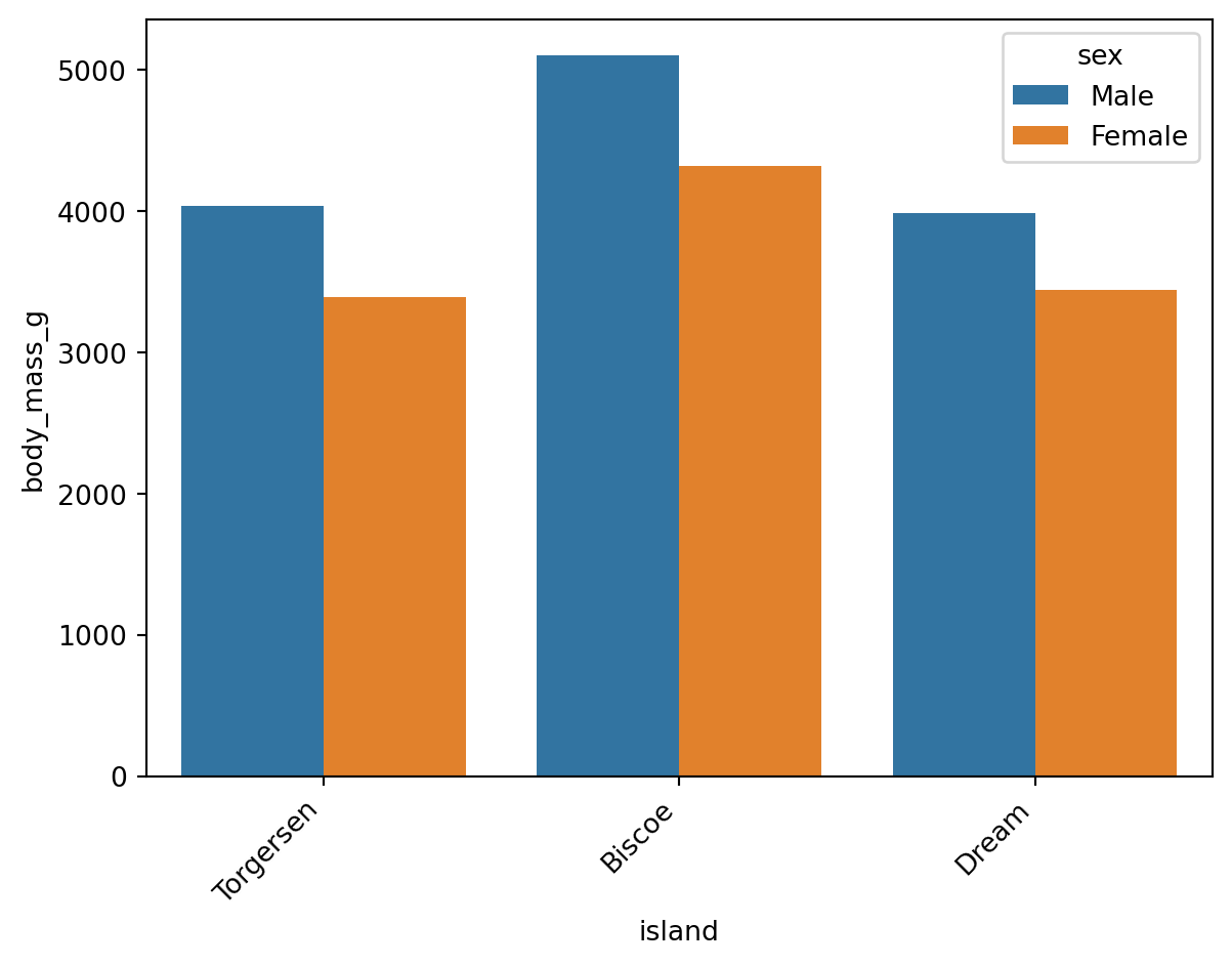
参考:plt.xticks() 函数用法(kwargs 栏目)
Wilke (2019, chap. 6.1) 建议:标签密集时,改为横向排版比旋转标签更易读:
# 在 ⭐2 的基础上,交换 xy 轴的数据,使表格横过来
sns.barplot(data=df, y='island', x='body_mass_g',errorbar=None,hue='sex')  #⭐3
#⭕注意:
#   xy 轴的 data 交换后,Seaborn 默认让 nominal data (此处为岛的名称)
#   当 category,让 ratio data (此处为体质量) 当 amount;
#   而非仍然默认 x轴 为 category ,y轴 为 amount。

plt.show()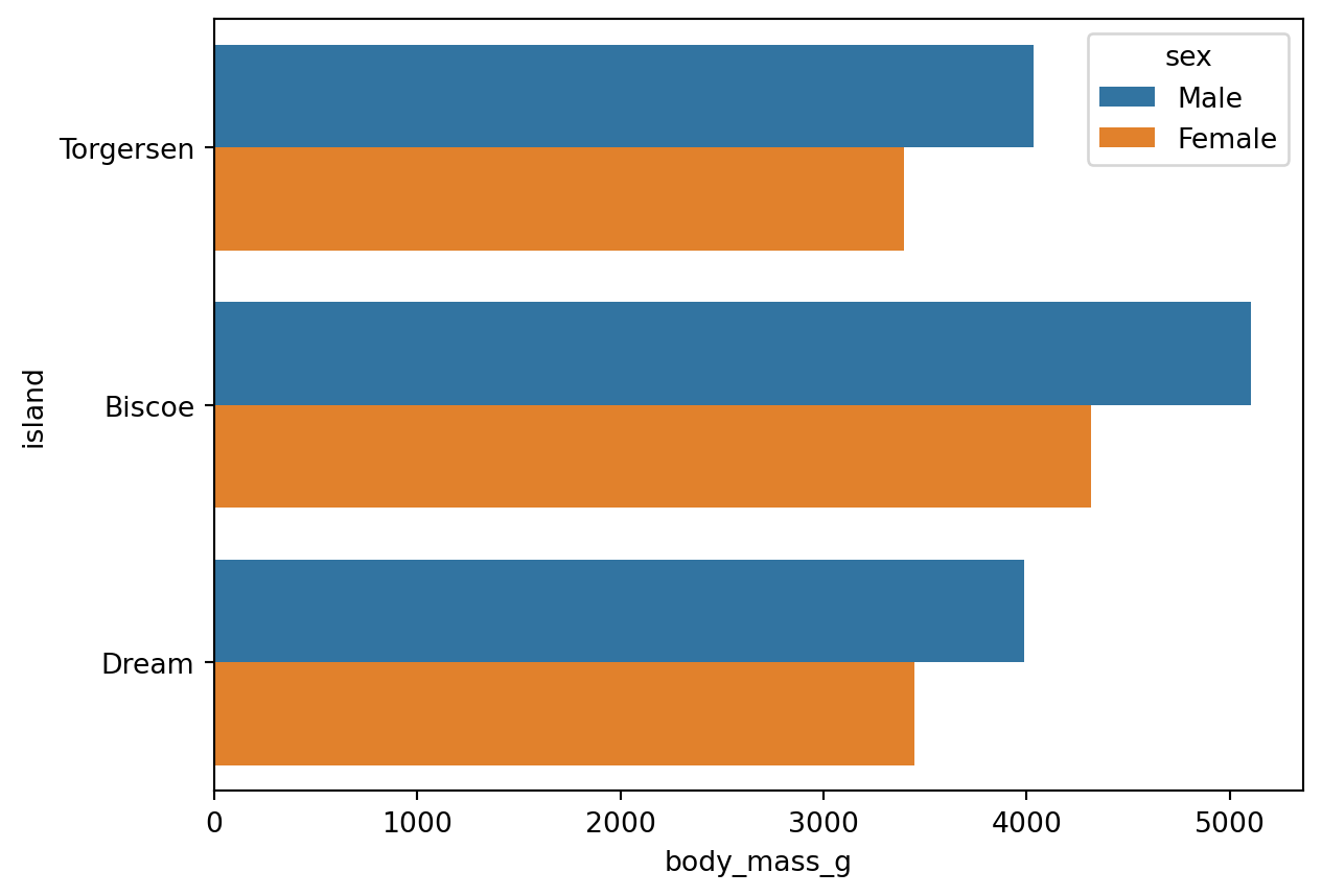
同样适用于 Count Plot:
# 以上技巧同样适用于 Count Plot
sns.countplot(data=df, y='species', hue='sex')

# 直接让 y轴 当 categories,并根据性别按照颜色分组。
# 此时 x轴 代表 "每种企鹅出现的次数"

plt.show()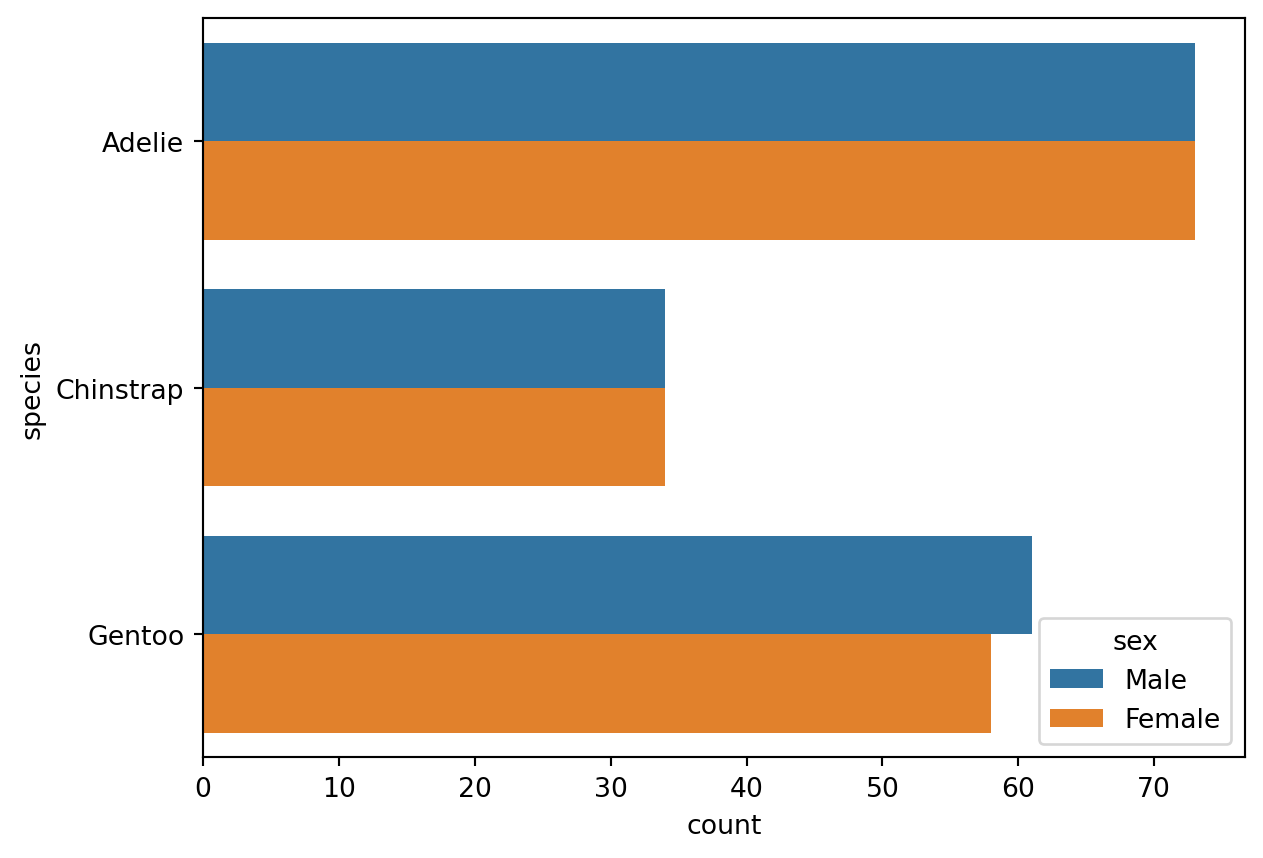
2.4 设置总主题风格
# 设置 Seaborn 绘图的总主题风格
sns.set_theme(font_scale=1.2, style='darkgrid')

# 字号 1.2,风格深色带网格。
# ⭕注意:sns.set_theme() 是 Seaborn 的一个全局函数,针对接下来所有用 Seaborn 画的图,而不是仅限于此代码块;
#   而 ax.set() 等方法(下文提到),仅针对 ax 这个具体的图表。
sns.set_theme() 设置全局绘图主题,作用于之后所有 Seaborn 图表。调用 sns.reset_orig() 可恢复默认主题。
# 在新主题风格下用 Seaborn 画图
ax = sns.barplot(data=df, y='island', x='body_mass_g',errorbar=None,hue='sex')  #还是⭐3,但定义了变量 ax,为了方便下一行 ax.set() 操作

# 然后,用 Matplotlib 库中的 ax.set() 方法 (method) ,给刚画的图表设置标题、标签等元素
ax.set(title='Penguin', xlabel='Body Mass (g)', ylabel='Island')

plt.show()
将 Seaborn 图表赋值给变量 ax 后,可调用 Matplotlib 方法进一步修改(类似将 DataFrame 赋值给 df 后再调用方法)。
注意:区分以下两者:
sns.set()/sns.set_theme():Seaborn 全局主题设置函数(两者等价,sns.set_theme()为首选)。ax.set():Matplotlib 中针对特定图表对象的方法,用于设置标题、轴标签等。
2.5 调整图例
无论 errorbar=None 还是 errorbar=('ci',0),图例均可能遮挡图表,需用 sns.move_legend() 手动调整位置。
# errorbar 不存在
ax = sns.barplot(data=df, y='island', x='body_mass_g',errorbar=None,hue='sex')
ax.set(title='Penguin', xlabel='Body Mass (g)', ylabel='Island')

plt.show()

# ⭕注:error bar 不存在,图例自动生成在右边
# errorbar 存在,但大小为0
ax = sns.barplot(data=df, y='island', x='body_mass_g',errorbar=('ci',0),hue='sex')
ax.set(title='Penguin', xlabel='Body Mass (g)', ylabel='Island')

plt.show()

#⭕注:error bar 存在但为 0,图例生成时自动避免了遮挡 error bar
# ⭐3
ax = sns.barplot(data=df, y='island', x='body_mass_g',errorbar=None,hue='sex')
ax.set(title='Penguin', xlabel='Body Mass (g)', ylabel='Island')

# 在 ⭐3 基础上加了一句函数调整图例位置大小
sns.move_legend(ax,bbox_to_anchor=(0.5,-0.2),loc='upper center',ncols=2)

#⭕【obj参数】
#   obj 参数是 sns.move_legend() 函数括号内的第一个参数。
#   它是一个图表对象,作为需要移动图例的源图表对象,此处为 ax。

#⭕【loc参数】
#   Seaborn 中此处的 loc参数 默认可以为 字符串 (str) 或 整数 (int)。
#   默认的字符串有 'upper left' 'upper center' 'down right' 等,
#   让图例自动位于图表的左上角、上部居中、右下角等位置。
#⭕【注意】
#   只设置了 loc参数 而不设置 bbox_to_anchor参数 时,loc 参数 代表 "图例位于整个图表的 XX (e.g. 右上角)"
#   而当同时设置了 loc参数 和 bbox_to_anchor参数 时,loc参数 代表 "图例的 XX (e.g.右上角) 位于整个图表的 (x,y) 位置"

#⭕【bbox_to_anchor参数】
#   用边界框来固定 (use a bound box to anchor the legend)。必须和 loc参数联用。
#   可以设置二元数组 (x,y) 或四元数组 (横坐标,纵坐标,宽度,高度),此处只用了二元数组。
#   此处 bbox_to_anchor=(0.5,-0.2) 和 loc='upper center' 联用,
#   意为 "让图例的上边缘中点,位于整个图表的 (0.5,-0.2) 位置"。

#⭕【ncols参数】
#   图例的列数 (The number of columns that the legend has),默认为 1
#   此处只有 male 和 female 两个组,最多分两列。

plt.show()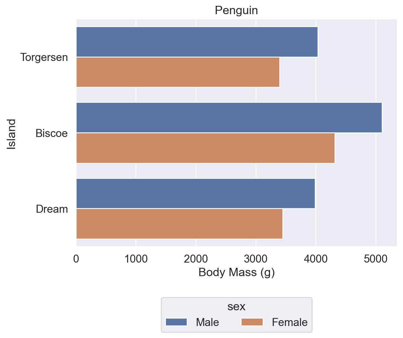
# 同上
ax = sns.barplot(data=df, y='island', x='body_mass_g',errorbar=None,hue='sex')
ax.set(title='Penguin', xlabel='Body Mass (g)', ylabel='Island')

# 只设置 loc参数 而不设置 bbox_to_anchor参数
sns.move_legend(ax,loc='lower right')

# 意为 "让图例位于整个图表的右下角"

plt.show()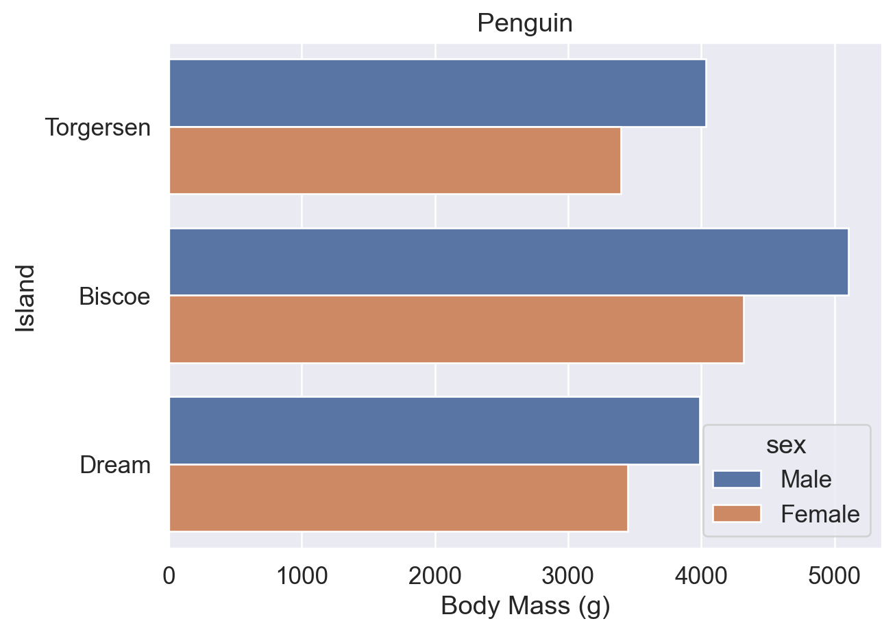
# 同上
ax = sns.barplot(data=df, y='island', x='body_mass_g',errorbar=None,hue='sex')
ax.set(title='Penguin', xlabel='Body Mass (g)', ylabel='Island')

# bbox_to_anchor参数 和 loc参数 联用
sns.move_legend(ax,bbox_to_anchor=(1,1),loc='upper left')

# 意为 "让图例的左上角位于整个图表的 (1,1) 位置"

plt.show()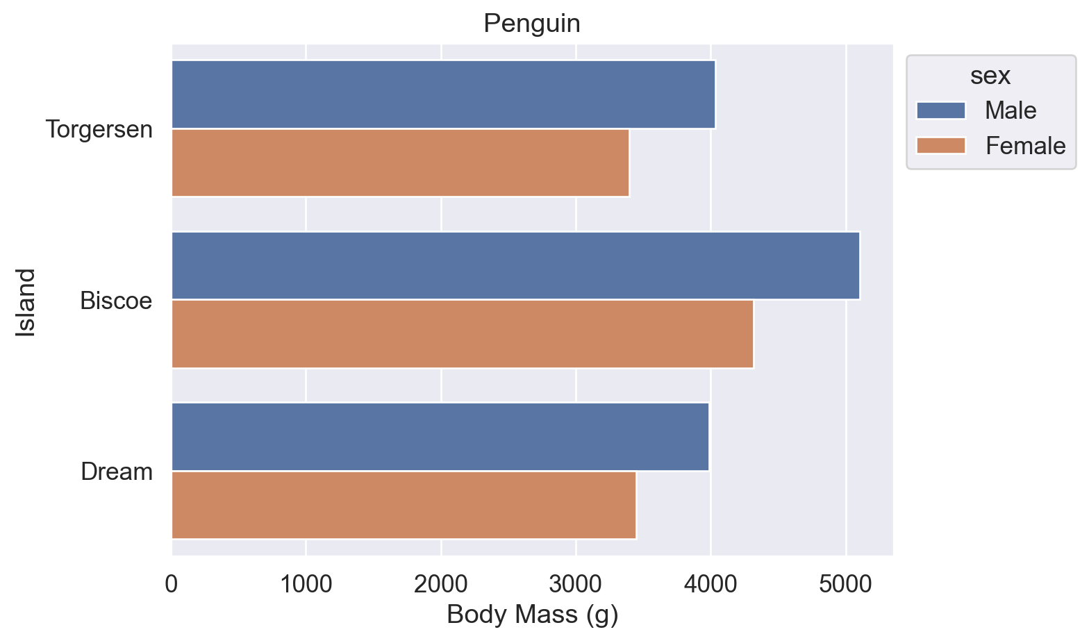
参考:
sns.move_legend() 用法(obj 参数、loc 参数)
matplotlib.axes.Axes.legend() 用法(loc、ncols、bbox_to_anchor 参数)
2.6 修改颜色
使用 palette 参数修改图表配色,可传入以下类型的值:
- Seaborn 预定义调色板名称(默认
'deep'):'deep'、'muted'、'bright'、'pastel'、'dark'、'colorblind' - Matplotlib Colormap 名称:如
'viridis'、'plasma'、'coolwarm'、'Blues'、'Reds' - HLS/HUSL 颜色模型:
'hls'、'husl' - Cubehelix 方案:
'ch:<args>',如'ch:s=0.5,r=-0.5'(色盲友好,支持灰度打印) - 渐变色:
'light:<color>'、'dark:<color>' - 混合色:
'blend:<color1>,<color2>' - 颜色代码列表:十六进制(
['#FF5733', '#33FF57'])、RGB 元组、Matplotlib 颜色名称
#【⭐4】默认初始 Seaborn 颜色方案
ax = sns.barplot(data=df, y='island', x='body_mass_g',errorbar=None,hue='sex')
ax.set(title='Penguin', xlabel='Body Mass (g)', ylabel='Island')
sns.move_legend(ax,bbox_to_anchor=(1,1),loc='upper left')

plt.show()
# ⭐4 的基础上,增加了 palette='flare' ('flare' 是 Seaborn 的预设颜色方案名称之一)
ax = sns.barplot(data=df, y='island', x='body_mass_g',errorbar=None,hue='sex', palette='flare')
ax.set(title='Penguin', xlabel='Body Mass (g)', ylabel='Island')
sns.move_legend(ax,bbox_to_anchor=(1,1),loc='upper left')

plt.show()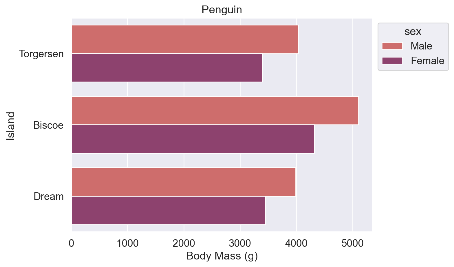
# Seaborn 预设颜色名称:'blue' 和 'orange'
ax = sns.barplot(data=df, y='island', x='body_mass_g',errorbar=None,hue='sex', palette=['blue','orange'])
ax.set(title='Penguin', xlabel='Body Mass (g)', ylabel='Island')
sns.move_legend(ax,bbox_to_anchor=(1,1),loc='upper left')

plt.show()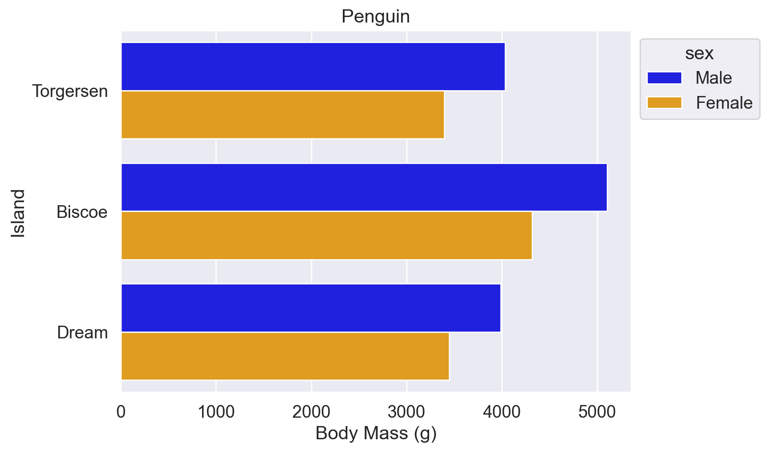
# 十六进制颜色代码:'#a1c9f4' 和 '#8de5a1'
ax = sns.barplot(data=df, y='island', x='body_mass_g',errorbar=None,hue='sex', palette=['#a1c9f4','#8de5a1'])
ax.set(title='Penguin', xlabel='Body Mass (g)', ylabel='Island')
sns.move_legend(ax,bbox_to_anchor=(1,1),loc='upper left')

plt.show()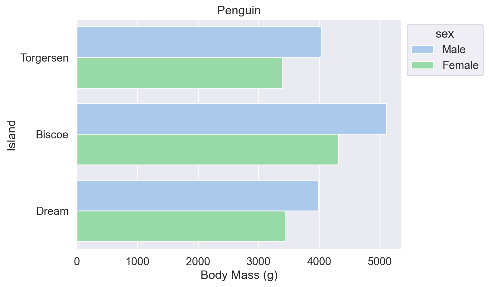
参考:
Seaborn sns.set_theme() 函数(palette 参数)
Seaborn sns.color_palette() 函数(预设调色盘名称表)
Matplotlib 预命名颜色一览
Matplotlib Colormap 一览
w3schools 颜色提取器
拓展:统计每个岛屿的企鹅数量
以下两种方式等效,可用于后续按总量排序柱状图。
法1:df.groupby().size()
#【法1】Pandas df.groupby() 函数和 .size() 函数
df.groupby('island').size()

#👆根据 'island' 列进行分组,同一个岛的所有行都分为一组。分组后得到一个 groupby object。
#  再用 .size() 函数求该 groupby object 的数据大小。
island
Biscoe 168
Dream 124
Torgersen 52
dtype: int64法2:df.value_counts()
#【法2】Pandas df.value_counts() 函数
df.value_counts('island')

# 直接用 .value_counts() 函数求 'island' 列内【每种】数据的数量。
# 如下,Biscoe 是一种数据,
island
Biscoe 168
Dream 124
Torgersen 52
Name: count, dtype: int643. 绘制其他图
3.1 点线图
柱状图的纵轴必须从 0 开始,以保证视觉比例与数据比例一致(Wilke (2019, chap.17) 的 Principle of Proportional Ink)。点线图无此限制,纵轴从数据范围起始,且 data-ink ratio 更高(干扰信息更少)。
当 x 轴为 nominal data(如岛屿名称)时,各点之间无需连线。
# 用 sns.pointplot() 函数画点线图
sns.pointplot(data=df, x='island', y='body_mass_g', hue='sex',linestyle='none')

#⭕注意:
#   也可以不写 linestyle='none',而写 join=False,意为不显示点与点之间的折线。
#   但是,join 参数将在 v0.15.0 版本的 Seaborn 库中被移除,建议使用 linestyle='none'

# 图中每个点上下的线是误差线

plt.show()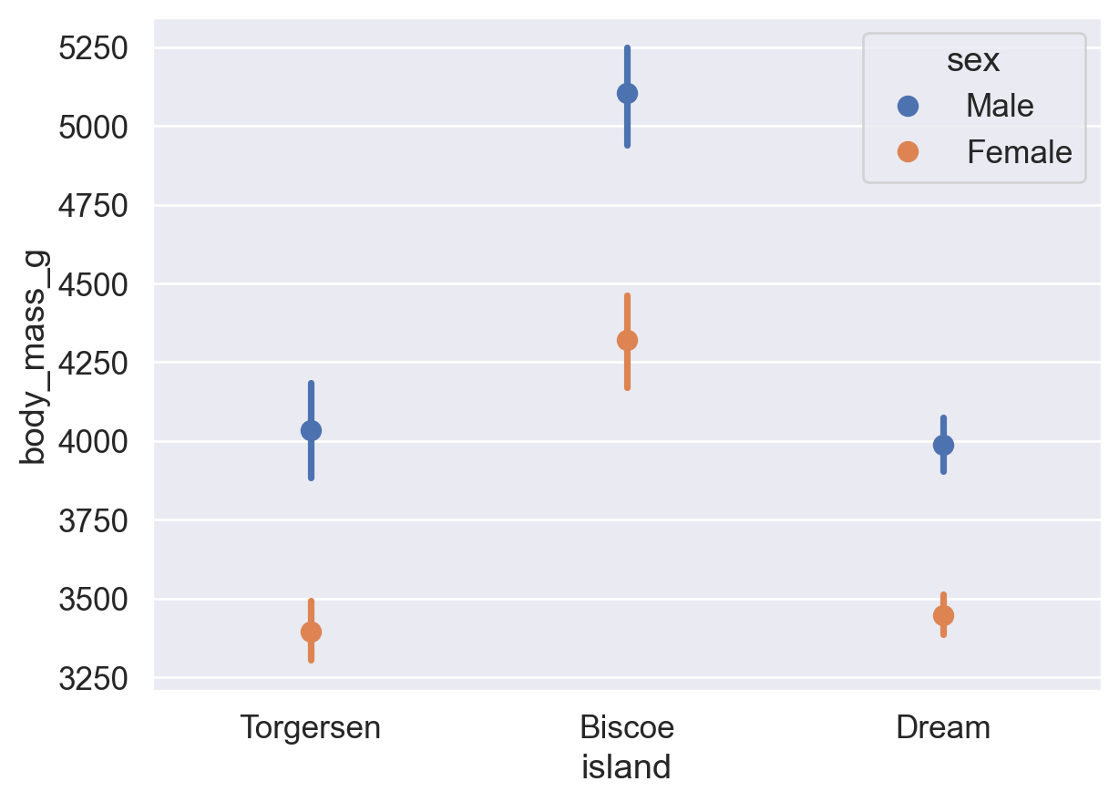
3.2 直方图
柱状图的 x 轴为离散类别(nominal/ordinal data);直方图的 x 轴为连续数值区间(ratio data)。
# 用 sns.histplot() 函数画直方图
sns.histplot(data=df, x='flipper_length_mm')  # x: 鳍长(mm)

plt.show()
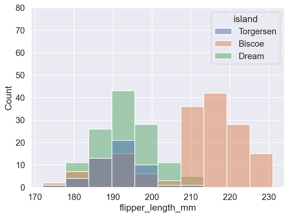
# 增加 hue 参数设置
sns.histplot(data=df,x='flipper_length_mm'
             ,hue='island'  # 按照岛屿进行颜色分组。
                            # 相当于每个岛屿内的企鹅单独画了一个 histogram,
                            # 再将四个 histogram 重叠了起来。
             )

# 注意纵坐标值范围,已产生变化。

plt.show()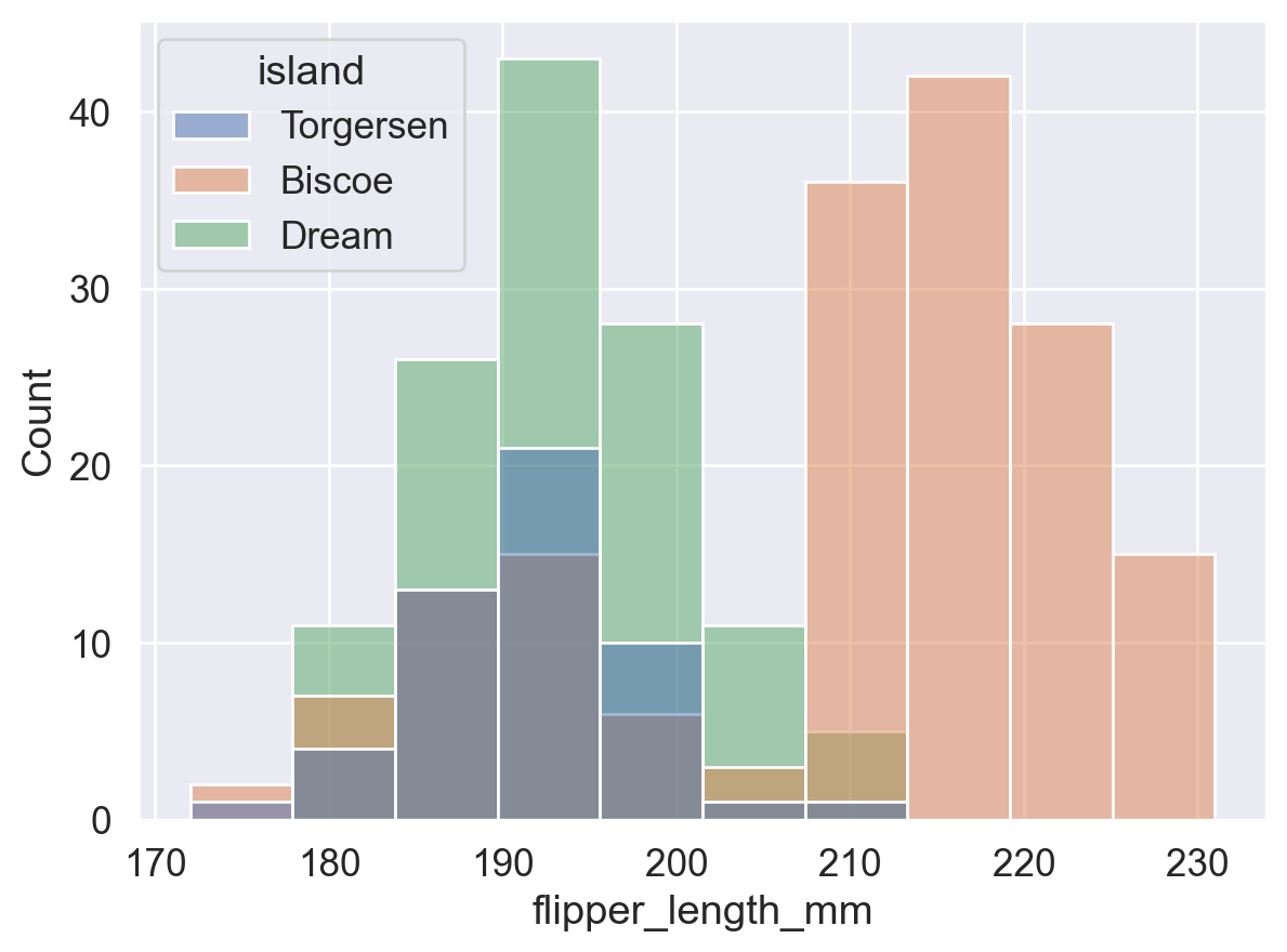
#【1】原直方图
sns.histplot(data=df, x='flipper_length_mm')
plt.show() #👈展示第一个直方图 (原直方图)

#【2】增加 hue 参数设置后的直方图
sns.histplot(data=df,x='flipper_length_mm'
             ,hue='island'
             )

# 可以通过设置 plt.ylim() 函数来调整 y 轴的刻度值范围,让两张图刻度范围一样,来观察区别
plt.ylim(0,80)
plt.show() #👈展示第二个直方图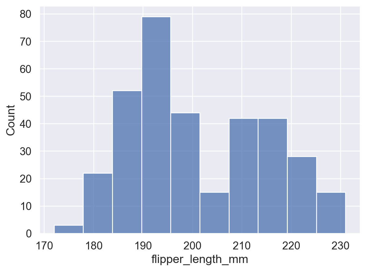
sns.histplot(data=df, x='flipper_length_mm'
             ,hue='island'        # 按照岛屿进行颜色分组
             ,stat='density'      # 使 bins 面积之和为 1,表示概率密度。
             ,common_norm= False  # 对整个每个组(每个岛屿)的数据单独进行归一化处理,下文会解释
             )

plt.show()
3.2.1 stat 参数
控制直方图的统计方式,可选值:
'count':bin 高度 = 该 bin 内的数据点数量(频数)。'frequency':bin 高度 = 频数 / bin 宽度(单位宽度内的频数,适用于 bin 宽度不统一的情况)。'probability'/'proportion':bin 高度 = 频数 / 总数,所有 bin 高度之和为 1。'percent':bin 高度 = (频数 / 总数) × 100,所有 bin 高度之和为 100。'density':bin 高度 = 频率 / 组距,所有 bin 面积之和为 1(频率分布直方图)。当 bin 宽度趋近于 0 时,即得到平滑密度曲线。
#⭕【1】stat='count'
ax = sns.histplot(data=df, x='flipper_length_mm',stat='count')

# 在每个条形上显示 bin 的【高度 (计数)】,此处仅为了方便展示,不用管下面的代码是什么意思。
for p in ax.patches:
    height = p.get_height()  # 获取条形高度
    ax.text(p.get_x() + p.get_width() / 2, height, int(height),  # int() 取整
            ha='center', va='bottom')  # 在每个条形顶部显示高度

plt.show()
#⭕【2】stat='frequency'
ax = sns.histplot(data=df, x='flipper_length_mm',stat='frequency')

# 在每个条形上显示 bin 的【高度】
for p in ax.patches:
    height = p.get_height()  # 获取条形高度
    ax.text(p.get_x() + p.get_width() / 2, height, int(height),  # int() 取整
            ha='center', va='bottom')  # 在每个条形顶部显示高度

plt.show()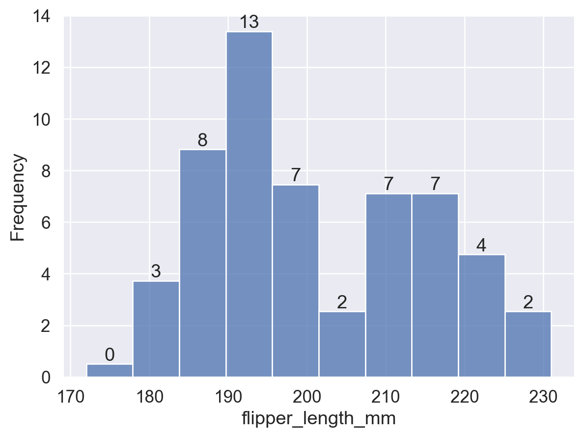
#⭕【3】stat='probability'
ax = sns.histplot(data=df, x='flipper_length_mm',stat='probability')

# 在每个条形上显示 bin 的【高度】
for p in ax.patches:
    height = p.get_height()  # 获取条形高度
    ax.text(p.get_x() + p.get_width() / 2, height, f'{height:.2f}',  # f'{}' 保留小数点后两位
            ha='center', va='bottom')  # 在每个条形顶部显示高度

plt.show()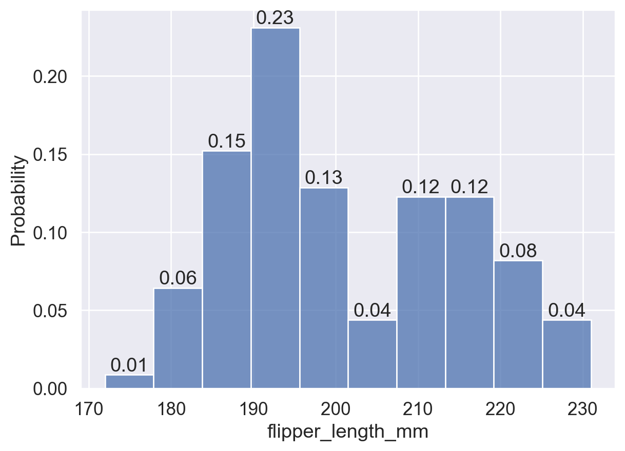
#⭕【4】stat='probability'
ax = sns.histplot(data=df, x='flipper_length_mm',stat='percent')

# 在每个条形上显示 bin 的【高度】
for p in ax.patches:
    height = p.get_height()  # 获取条形高度
    ax.text(p.get_x() + p.get_width() / 2, height, int(height), # int() 取整
            ha='center', va='bottom')  # 在每个条形顶部显示高度

plt.show()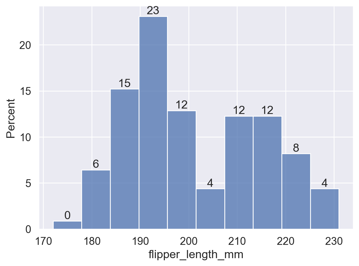
#⭕【5】stat='density'
ax = sns.histplot(data=df, x='flipper_length_mm',stat='density')

# 在每个条形上显示 bin 的【高度】
for p in ax.patches:
    height = p.get_height()  # 获取条形高度
    ax.text(p.get_x() + p.get_width() / 2, height, f'{height:.3f}', # f'{}' 保留小数点后三位
            ha='center', va='bottom')  # 在每个条形顶部显示高度

plt.show()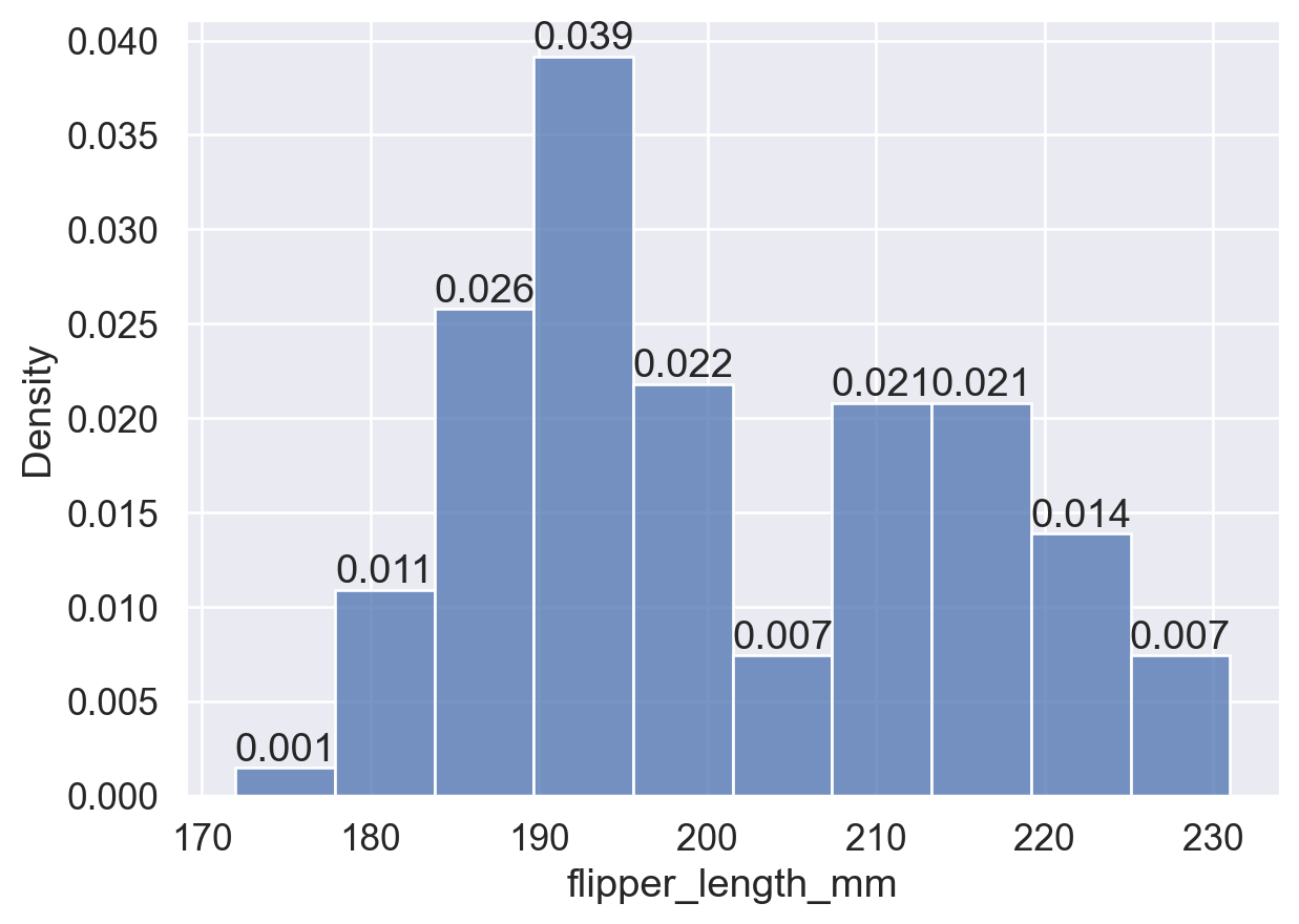
3.2.2 common_norm 参数
布尔值,仅在 stat 为 'probability'、'proportion'、'percent' 或 'density' 时生效,默认为 True:
common_norm=True:基于整个数据集归一化,不同组间的 bin 高度可直接比较。common_norm=False:各子组独立归一化,bin 高度仅在组内有意义。
# common_norm = True
sns.histplot(data=df, x='flipper_length_mm'
             ,hue='island'       # 按照岛屿进行颜色分组
             ,stat='density'     # 使 bins 面积之和为 1,表示概率密度。
             ,common_norm=True   # 对整个数据集(所有组)进行归一化处理。即,所有颜色的 bins 面积总和为 1。
                                 # 注:bins 都是默认半透明的,三组分布重叠在一起。
             )

plt.show()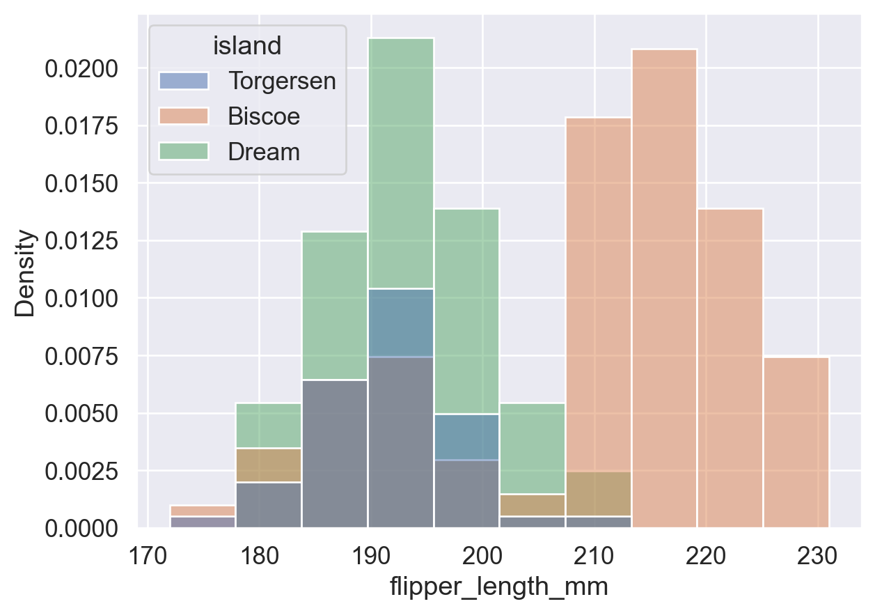
# common_norm = False
sns.histplot(data=df, x='flipper_length_mm'
             ,hue='island'       # 按照岛屿进行颜色分组
             ,stat='density'     # 使 bins 面积之和为 1,表示概率密度。
             ,common_norm=False  # 对每个组(岛屿)单独进行归一化处理。
                                 # 即,每种颜色的 bins 面积之和分别为 1,
                                 # 即,所有蓝色的 bins (Torgersen岛) 面积总和加起来为 1;
                                 # 所有橘黄色 bins (Biscoe岛) 面积加起来为 1;
                                 # 所有绿色 bins (Dream岛) 面积加起来也为 1。
             )

plt.show()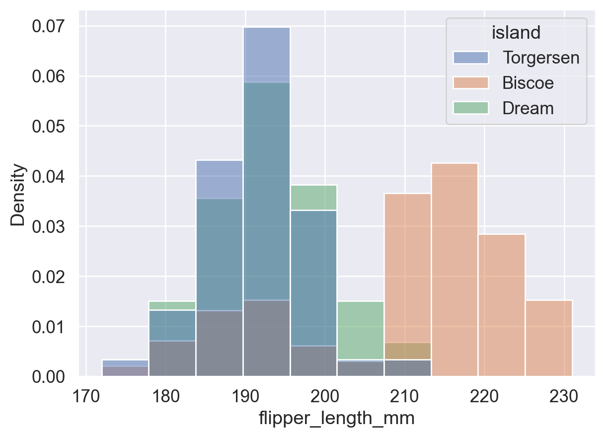
分组重叠不清晰时,可用 data=df[df['列']==值] 筛选数据,为各组分别绘图:
# 分布图1:Torgersen 岛上所有企鹅根据鳍长的分布情况
ax = sns.histplot(data=df[df['island']=='Torgersen'], x='flipper_length_mm',stat='density')
ax.set(title='Torgersen', xlabel='Flipper Length (mm)')
plt.show()
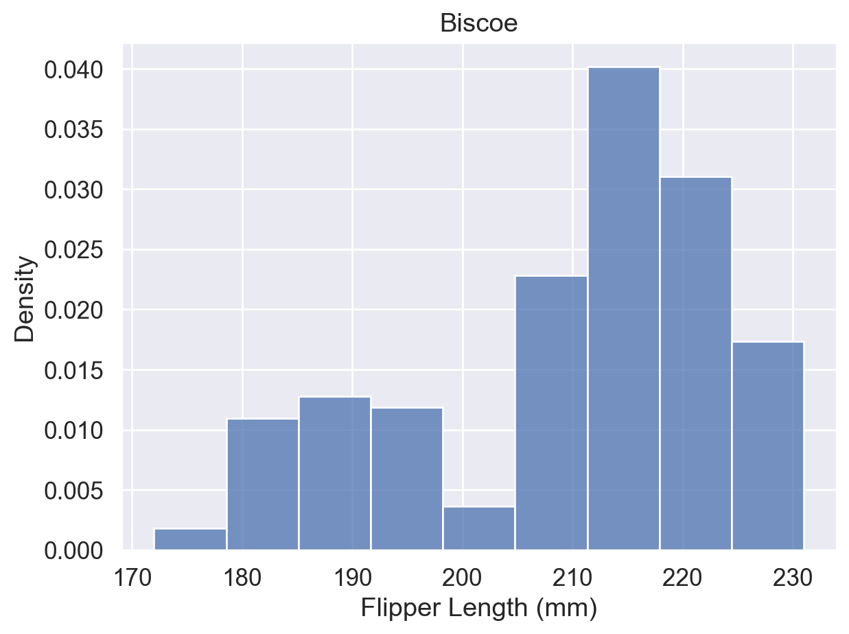
# 分布图2:Biscoe 岛上所有企鹅根据鳍长的分布情况
ax = sns.histplot(data=df[df['island']=='Biscoe'], x='flipper_length_mm',stat='density')
ax.set(title='Biscoe', xlabel='Flipper Length (mm)')
plt.show()
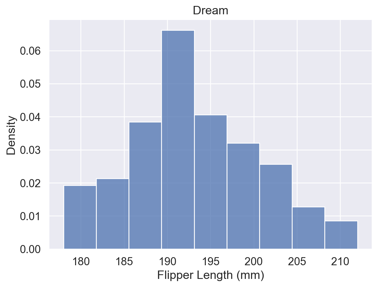
# 分布图3:Dream 岛上所有企鹅根据鳍长的分布情况
ax = sns.histplot(data=df[df['island']=='Dream'], x='flipper_length_mm',stat='density')
ax.set(title='Dream', xlabel='Flipper Length (mm)')
plt.show()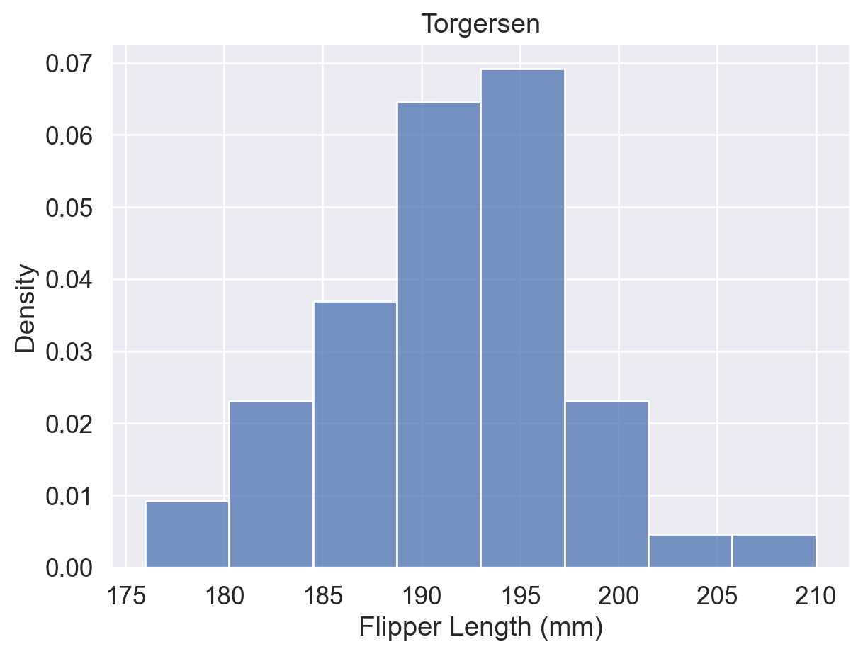
参考:sns.histplot() 函数用法(hue、stat、common_norm 参数)
3.3 箱线图
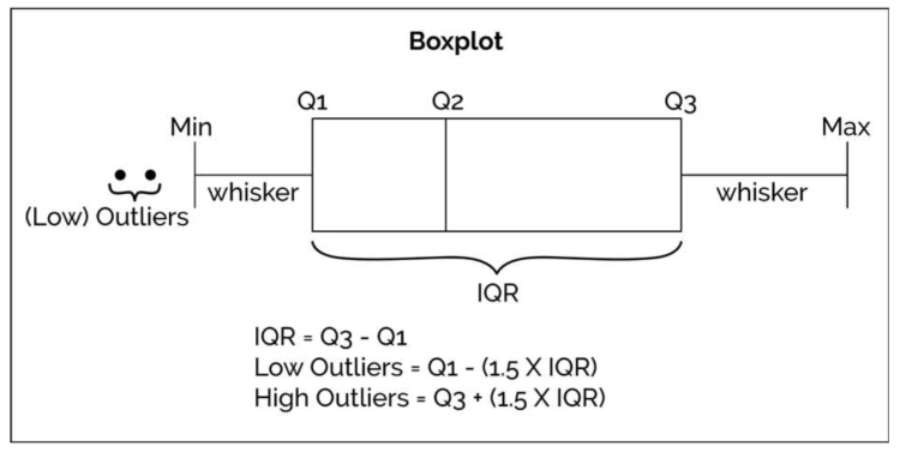
箱线图(boxplot)通过五个关键值概括数据分布:Min、Q1、Q2(中位数)、Q3、Max,并标记超出须范围的异常值。
- 箱体:Q1 至 Q3,包含中间 50% 的数据。
- 箱内线:中位数(Q2)。
- 须:从 Q1/Q3 向外延伸,默认至 1.5 × IQR 范围内的极值。
- 异常值:超出须范围的点单独标记。
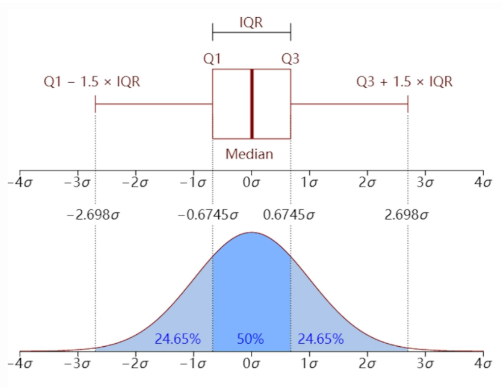
箱线图 vs. 直方图
箱线图适合快速识别分布概况与异常值;直方图适合查看具体区间内的频率分布。
# 用 sns.boxplot() 函数绘制箱线图
sns.boxplot(data=df, x='flipper_length_mm', y='island',hue='sex')

#👆绘制不同岛屿上雌雄企鹅各自的箱线图

plt.show()
# 调整【fliersize参数】来修改异常点的大小
sns.boxplot(data=df, x='flipper_length_mm', y='island', hue='sex'
             ,fliersize=8   # 异常点的大小设置为 8 个单位。
            )

plt.show()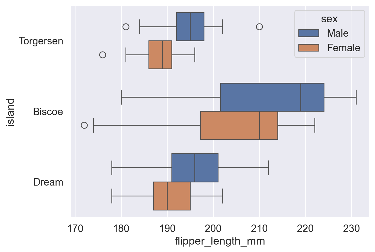
# 调整【whis参数】来修改须的长度范围
sns.boxplot(data=df, x='flipper_length_mm', y='island', hue='sex'
             ,fliersize=8   # 异常点的大小设置为 8 个单位。
             ,whis=2        # 须分别延伸至距离 Q1 和 Q3【2倍IQR】的范围。默认为 1.5倍IQR。
                            # 注:此处 whis 设置为 2 之后,须 (whisker) 已经涵盖了所有数据值,图上也就没有异常点了。
            )

plt.show()
参考:sns.boxplot() 函数用法(fliersize、whis 参数)
3.4 小提琴图
小提琴图结合了箱线图(中位数、分位数)与密度曲线(平滑分布)的特点。数据量较少时,平滑曲线可能失真,建议改用直方图或箱线图。
# 用 sns.violinplot() 函数绘制小提琴图
sns.violinplot(data=df, y='island', x='flipper_length_mm', hue='sex')

plt.show()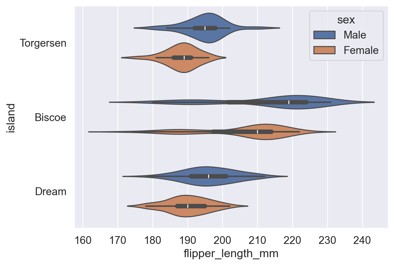
# 通过【split参数】控制不同分组的图是否合并在一起
sns.violinplot(data=df, y='island', x='flipper_length_mm', hue='sex'
                ,split=True  # 加入 split=True,让不同分组(不同性别)的图合并在一起,便于观察
               )

plt.show()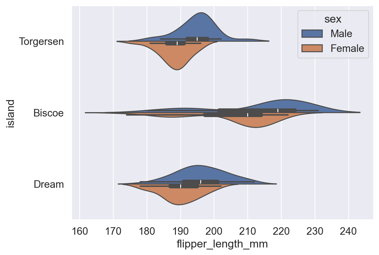
参考:sns.violinplot() 函数用法(split 参数)
3.5 散点图 & 分簇散点图
Strip plot 绘制所有数据点(每点一个圆点),直观展示原始分布;Swarm plot 自动分散重叠点,可读性更高。
注意:两者均展示单变量分布(某数据在各区间的密度),不同于展示两变量相关趋势的 scatter plot。
| 对比维度 | strip plot(散点条带图) | swarm plot(蜂群图) |
|---|---|---|
| 基本概念 | 将数据点沿分类轴随机抖动(jitter)以避免重叠 | 通过算法精确排列点,避免重叠并展示分布 |
| 点的排列方式 | 随机抖动,可能仍有重叠 | 非随机,基于密度自动调整位置,完全避免重叠 |
| 可读性 | 数据量小时较清晰,数据量大时容易重叠 | 在中小规模数据中更清晰展示分布形状 |
| 计算复杂度 | 较低,绘制速度快 | 较高,数据量大时绘制较慢 |
| 适用场景 | 快速可视化、小数据集、对精确分布要求不高 | 展示数据分布细节、中等规模数据 |
| 分布表现能力 | 一般,难以体现真实密度 | 较强,可直观体现数据密度 |
| 参数控制 | 可通过 jitter 控制抖动程度 |
无需 jitter,由算法自动调整 |
| 示例函数 | sns.stripplot() |
sns.swarmplot() |
# 用 sns.stripplot() 函数绘制散点图
sns.stripplot(data=df,x='flipper_length_mm',y='island',hue='sex')
plt.show()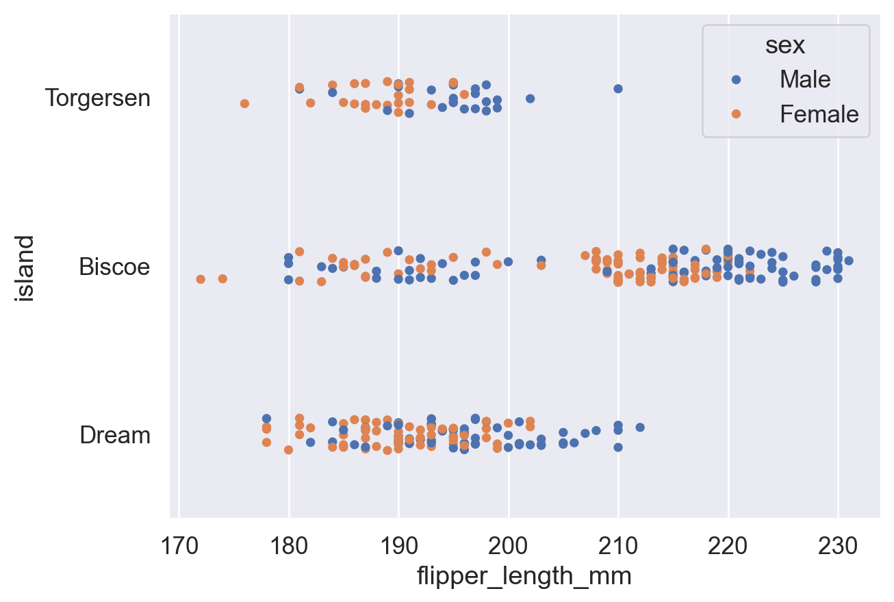
# 用 sns.swarmplot() 函数绘制分簇散点图
sns.swarmplot(data=df,x='flipper_length_mm',y='island',hue='sex')
plt.show()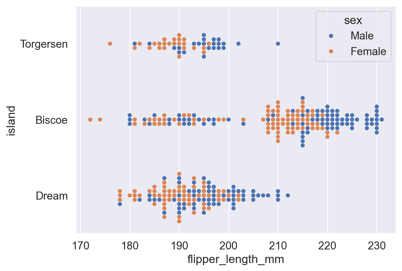
相关链接合集
总体链接:
Python3 教程文档 (中文) (查看内置函数用法等)
Pandas库 教程文档 (DataFrame)
Matplotlib库 教程文档 (plt)
Seaborn库 教程文档 (barplot)
sns.barplot()函数(用 Seaborn 绘制 柱状图)
sns.countplot()函数 (用 Seaborn 绘制 计数图)修改图表主题风格:
plt.xticks()函数 ( kwargs (keyword argument) 栏目中写了如何旋转刻度标签)
sns.set()函数 (同sns.set_theme()函数)
sns.set_theme()函数 (设置 Seaborn 绘图的全局主题风格)
ax.set()方法 (Matplotlib 中 对于特定图表 ax 设置标题、轴标签等元素的方法)修改图例:
sns.move_legend()函数 (Seaborn 中 移动图例的函数)(查看 obj参数 和 loc参数 的用法)
matplotlib.axes.Axes.legend()函数 (Matplotlib 中 设置图例的函数,其指令也适用于sns.move_legend())(查看 loc参数 ,ncols参数 和 bbox_to_anchor参数 的用法)修改图表颜色:
Seabornsns.color_palette()函数 (查看 palette参数 预设调色盘名称表)
Matplotlib 预命名颜色一览
Matplotlib Colormap 一览
Matplotlib Colormap 使用介绍
w3schools 颜色提取器 (查看任意颜色的十六进制代码)其他图表:
sns.pointplot()函数用法 (点线图画法)
sns.histplot()函数用法 (频率分布直方图画法)(查看 hue参数 ,stat参数 和 common_norm参数 )
sns.boxplot()函数用法 (箱线图画法) (查看 fliersize参数 和 whis参数 )
sns.violinplot()函数用法 (小提琴图画法)
sns.stripplot()函数 (分布散点图画法)
sns.swarmplot()函数 (分簇分布散点图画法)教材书 Fundamentals of Data Visualization (Wilke, 2019) :
6.1 Bar Plot (旋转的文字刻度不方便阅读,应当横过来排版)
17. The Principle of Proportional Ink (比例标记的原则:图形大小比例应当和数据真实的比例一样。e.g. 柱状图的柱子应当从 0 开始)